Does Colorful Packaging Make a Difference?
Color plays a huge role in packaging design and initial product impressions. Research shows that 85% of consumers cite color as the primary reason for choosing a product, with 90% of quick impressions made about a product based solely on color. This means that packaging design isn't just about aesthetics—it directly influences purchasing decisions.
The Psychology Behind Packaging Colors
Different colors evoke different emotions and create unique associations. Choosing the right color strategy ensures your product stands out while conveying the right message to your audience. Understanding these associations can help brands influence consumer perception and drive sales.
Warm colors are associated with energy and excitement–red can signify passion and urgency, appetite stimulation, orange often draws on creativity and enthusiasm, and yellow brings to mind optimism and happiness.
Cool colors often reflect trust and freshness; blue reflects reliability and calmness, green is obviously eco-friendliness, health, and nature, and gray can depict neutrality, sophistication, and timeless appeal.
Luxury & high-end products are often associated with deep, dark, and metallic colors like black, gold, and deep red.
Eco-friendly & natural products usually stick to colors that mimic earth, organic, and sustainability like beige, green, and brown.
How Color Influences Food Packaging
Color can play a larger role than you think in your food and beverage packaging. Research shows that color can alter taste perception and influence consumer expectations. Warm colors, particularly red and orange, are commonly used for indulgent foods, such as fast food, snacks, and sweets because they enhance cravings and stimulate appetite. Cool colors like green and blue are more commonly found in organic, fresh, and healthy food products, reinforcing the perception of purity and wellness.
Consumers expect specific colors to be associated with certain flavors—lavender should be purple, citrus should be yellow or orange, and mint should be green. A mismatch between color and flavor can lead to confusion and even product dissatisfaction.
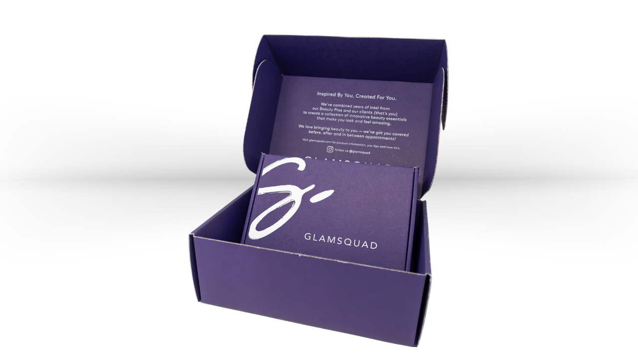
The Role of Color in Cosmetics Packaging
In the cosmetics industry, color can define a brand’s identity and attract the right audience. The right shade can convey luxury, youthfulness, or trustworthiness. Soft pinks and pastels dominate skincare and beauty packaging, reinforcing ideas of femininity, gentleness, and youthfulness. Black and gold, on the other hand, are widely used in high-end beauty products, creating an air of exclusivity and luxury. White is often chosen for dermatological or sensitive skincare products, emphasizing purity, simplicity, and cleanliness. Because cosmetics follow fashion and seasonal trends, brands frequently update packaging colors to align with the latest industry shifts, ensuring continued consumer interest.
Consumer Demographics & Color Preferences
Marketing to your target demographic is critical, and color can help you speak directly to your ideal customer. Younger consumers, especially children, gravitate toward bright, bold colors, while adults tend to favor cooler, more subdued tones. Gender also plays a significant role—men’s products often feature strong, dark shades like black, navy, and gray, whereas women’s products lean toward softer, warmer hues such as pink, white, and pastels. Moreover, Brands expanding into global markets must carefully consider these regional color associations to ensure their packaging resonates with local consumers.
At Viking Packaging, we know that colorful packaging makes a difference. Our color printing capabilities allow brands to print on both the inside and outside of cartons in a single operation—a unique service that enhances brand storytelling. Our design team specializes in creating packaging that aligns with your product goals, target audience, and industry trends.
Get in touch with the team at Viking today to see how we can bring your packaging to life.